VISUAL BRAND IDENTITY
—
VISUAL BRAND IDENTITY —
CASE STUDY
Dorado
Introducing Dorado—a coffee brand inspired by Colombian heritage, golden warmth, and the ritual of a truly satisfying brew. Rooted in culture and crafted with care, Dorado brings depth and richness to every cup, celebrating the intersection of tradition and modern taste.
Dorado’s vision is to offer premium Colombian coffee that honors its origin while appealing to today’s discerning coffee drinker. With a focus on quality, storytelling, and intentional design, Dorado invites customers to slow down and savor a more meaningful coffee experience.
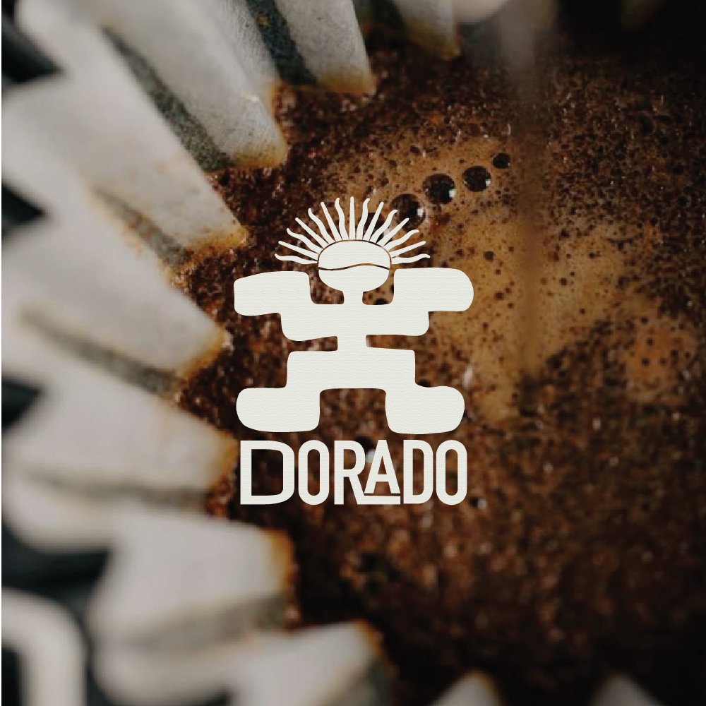
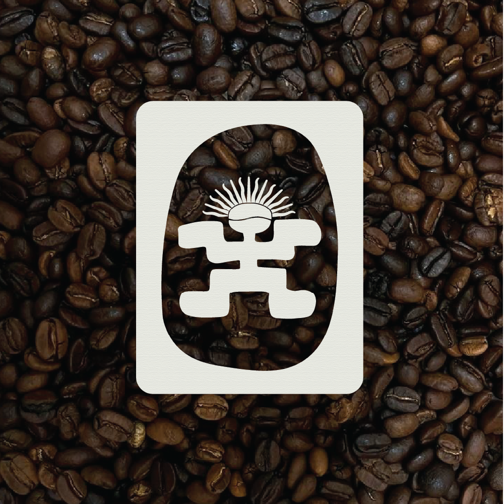
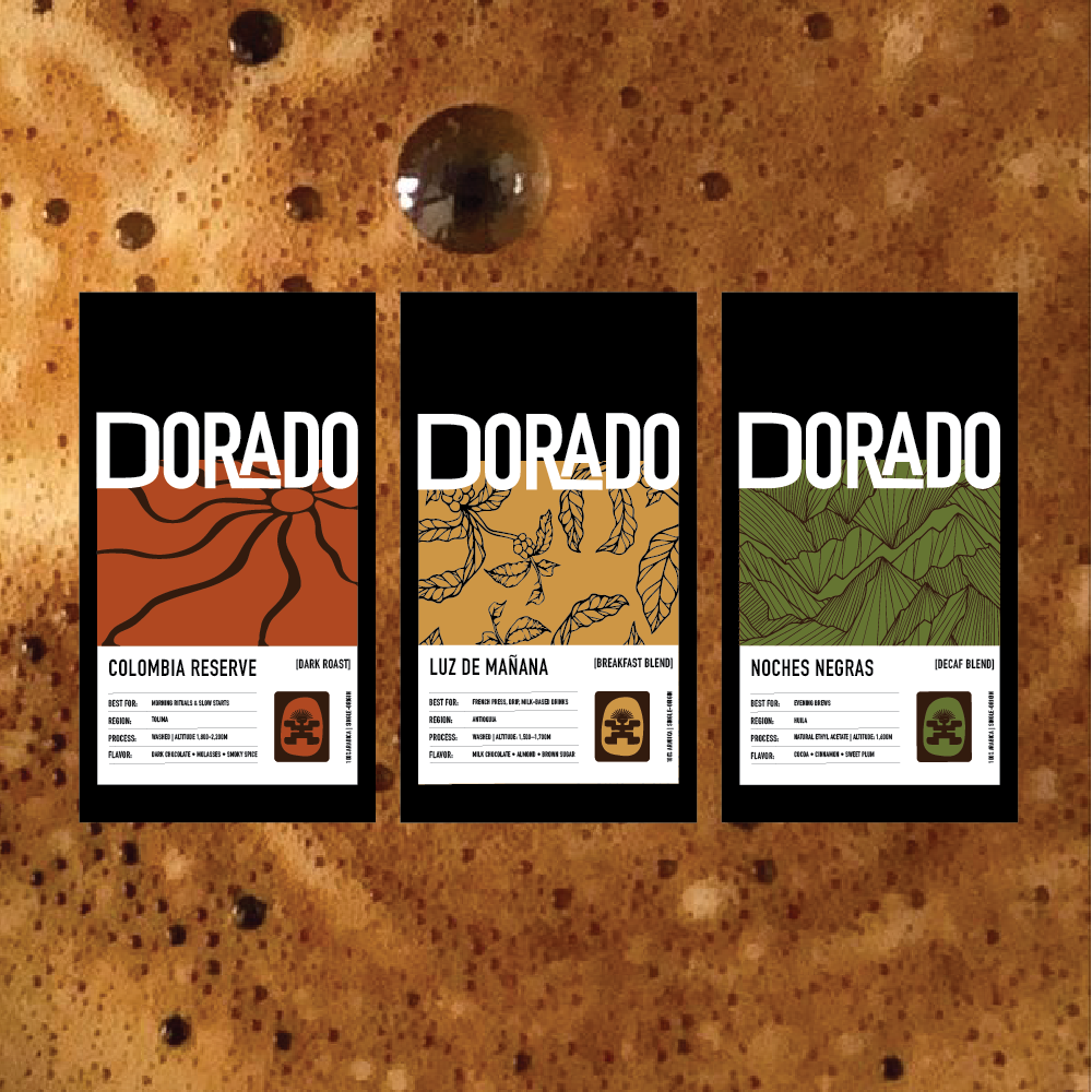
We created a refined brand identity anchored in symbolism: the gold emblem nods to Colombia’s El Dorado legend, the coffee bean represents craftsmanship, and the radiating sun evokes energy and warmth. The logo and visual system strike a balance between elegance and authenticity, reflecting the brand’s roots and its elevated positioning.
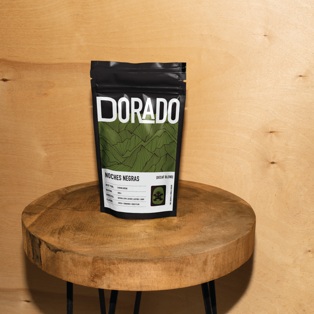
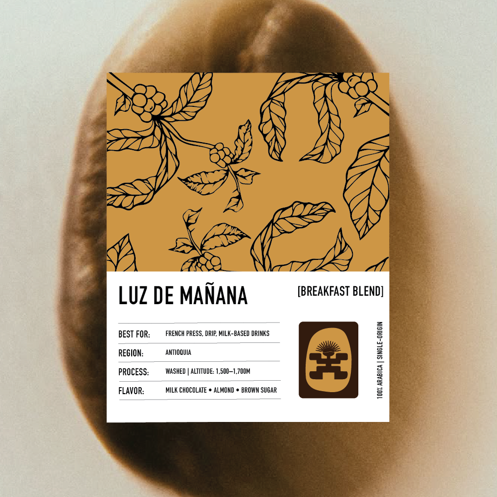
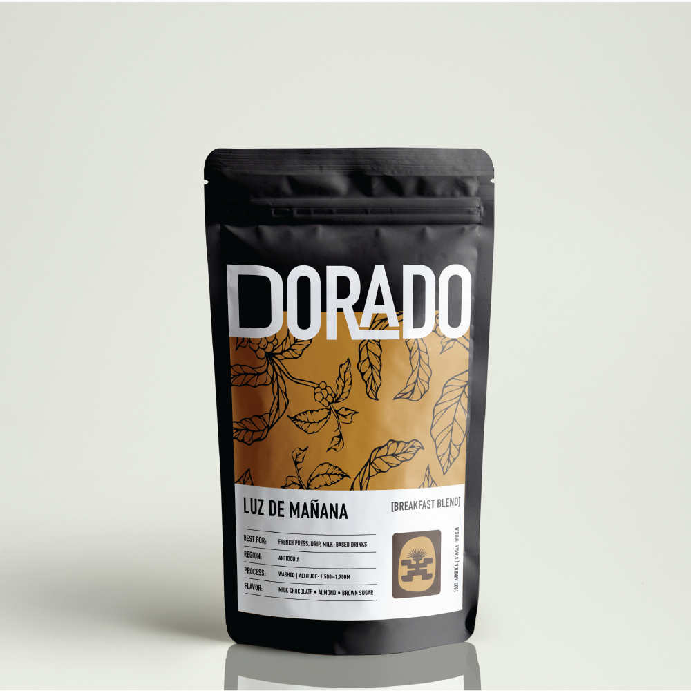
Packaging was thoughtfully developed to highlight Dorado’s different blends through distinct yet cohesive patterns, drawing from Colombian textiles and nature. The result is a visual language that feels both grounded and aspirational.
From strategy to execution, every detail of Dorado’s brand tells a story of legacy, flavor, and connection. The final identity positions Dorado as more than just a coffee—it’s a daily ritual infused with heritage, heart, and a golden standard.